
Map of the Week: Mapping scent in Cityscapes


As humans our sense of smell or olfaction often triggers the recollection of memorable experiences and the reflexive tuning of our taste buds. How we rectify these triggers with our physical experience informs our response to navigation and often our reaction/attraction to others areas and items in our world. In this the aromatic qualities of our urban landscape absorb a perfume accessory to its inhabitants but often heavily informed by their presence and ever-important to our experience of geographic space.
A few projects have tackled the geospatial architecture of city scents and most recently so has our featured guest blogger. Read on to learn how he built SmellScapes using CartoDB!
If you've read up on some recent olfactory map press you might be familiar with the Smelly Maps of London and Barcelona. These 'maps of the week' are brought to you by Rossano Schifanella an Assistant Professor in Computer Science at the University of Turin Italy. He designs new mapping tools aware of people’s multi-sensory experience and works on computational methods to model aesthetics creativity and social behavior in online platforms. In the following post he'll describe how he built these maps and why.
On Mapping Scent
Humans are able to potentially discriminate between more than one trillion different odors. Yet city officials and urban planners deal only with the management of less than ten bad odors out of a trillion. This negative and oversimplified perspective is mainly due to the difficulty of measuring smell at scale. The goal of this project is to open up a new stream of research that celebrates the positive role that smell has to play in city life and to capture the urban smellscape through the lenses of digital data. The smelly maps of London and Barcelona show at a street segment level the most characteristic smell perceived in the area.
See how animal scents pervade city parks:
Smellscape Datasets
To create the smellscape of a city first we collected smell-related words from Kate McLean’s work and then we crawled pictures tagged with those terms from a corpus of Creative Commons Flickr geo-referenced photos. Studying the co-occurrences of smell related words in our photo corpus we were able to automatically detect semantically coherent smell categories (e.g. nature emissions food or animals) that strikingly resembled the smell categories from the literature (for example the categorization offered by Victoria Henshaw in her book “Urban Smellscapes: Understanding and Designing City Smell Environments”). Once we knew which tag was associated with a particular smell category we were able to map the smellscape of an entire city simply using the coordinates attached to the Flickr pictures and matching them with the street segment geometry extracted from OpenStreetMap data. The maps in this post show at street segment level the most characteristic smell perceived in a street.
Style Behind Smells
I used a Category style since the map shows categorical data i.e. each street segment is colored with the smell category that has the highest concentration in the area while the intensity of the smell is not taken into account in our use case. We wanted to show a high level olfactory footprint of a street that was able to capture which smell a dweller will experience the most walking through that street.
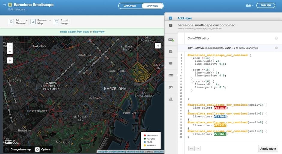
I didn’t use any particular API or library (learning now!) I imported the smell corpus and the OpenStreetMap data using the import wizard and then I filtered the original data with simple SQL statements to show the four most common smell categories for simplicity. I heavily used the CSS tab modifying the lines style attributes that has been crucial to deliver a visually appealing interface.
Sharing SmellScapes with the World
As a newcomer to the CartoDB ecosystem I was impressed by how straightforward it was to implement a high quality interactive and visually appealing map following the wizards and applying a bunch of customizations through the CartoDB Editor interface. The result was ready for being shared with the press in the blink of an eye; the New Scientist Washington Post Telegraph and Wired all took interest!
For a scientist who wants to disseminate his results to a broad audience that’s one of the most valuable features a mapping tool can provide.
As a computer scientist and a geek fascinated by the maps and visualization tools I’m excited to explore all the features provided by the CartoDB Platform in particular the ability to manage data through APIs and to perform geospatial analysis on the fly. Currently I’m using the CartoDB.js library to incorporate smell related information to an external visualization of pleasant routes in a city. So far so cool stay tuned!
Interested in following up or just keeping apprised? Follow Rossano on Twitter @rschifan check out all of his maps on his profile page and read up on the project via the site and the accompanying research paper. And finally follow the work of Rossano's collaborators: Daniele Quercia (formerly at Yahoo Labs visiting at University of Cambridge) Luca Maria Aiello (Yahoo Labs) and Kate McLean (Royal College of Art) whose collective efforts made this project possible.
Meantime happy data mapping!
