How NewsBeast Labs Visualized Roe V' Wade


The following post was initially published on the NewsBeast Labs tumblr and comes to us via Michael Keller senior data reporter at Newsweek & the Daily Beast.
Michael is a reporter designer and programmer working on ways to create interactive stories that let readers see how they fit into the story and in reader feedback stories ways to see how readers lives have intersected with the story's subject matter. What follows is a repost from their blog.
Last month we published a package of stories marking the fortieth anniversary of the Roe v. Wade decision. It had a few moving parts but I’ll just go over some of them briefly here.
How it started
This summer you probably heard the story about the last abortion clinic in Mississippithat was threatened to close due to stricter state laws. Allison Yarrow who sat across from me at the time was covering the story and it got us thinking: the line “The Last Abortion Clinic in Mississippi” is attention grabbing but it doesn’t tell the whole story. That is to say what you really want to know is how far are people away from their nearest clinic regardless of state boundaries. One state may have five clinics but if they’re all in the southwest corner of the state and you live in the northeast corner and your adjoining states have multiple clinics but only at their borders farthest from you then you’ll have a hard time getting to a clinic even if you had many in your state. To see where this might be the case and where access to services was compounded by new restrictive provisions (over 150 nationally in the past two years) we made as close to a comprehensive database as possible of every abortion clinic. Our goal was to see what parts of the country were farthest from a clinic. From start to finish this process took about six months.
We got our address data from a variety of publicly available sources: Planned Parenthood the National Abortion Federation anti-abortion websites that keep their own lists and others. We needed to verify that the address information was correct though so we called over 750 clinics to confirm. We also asked them up to how many weeks they offer services. The resulting database is the only one of its kind that we know of. The Guttmacher Institute undertook an abortion provider census in 2008 but they didn’t separate clinics from hospitals from private doctors offices which represent different levels of care that we thought was an important distinction.
What it became
We started this in July and the project evolved. We thought the election might bring the issue of abortion access to the fore but it didn’t and that gave us more time. Allison brought up the fortieth anniversary of Roe v. Wade and that let us think much bigger about the project. Because this was such a personal subject matter we knew readers’ comments would feature prominently (from both sides of the issue) and we wanted a strong narrative component too.
To give a human voice to the Geography of Abortion Access map Allison flew to Wichita Kansas one of the areas that stood out both on our map as a metro area far from a clinic as well as in recent memory as the site of the 2008 murder of late-term abortion provider George Tiller. To add a broader perspective Sam Register who runs the Newsweek Archivist tumblr went through the Newsweek archives so people could follow the topic’s coverage from the 70s through the 00s.
What we learned from reader’s stories
Over the course of the week we shifted the question we were asking from why do you support or oppose legal abortion to a conversation about pro-life and pro-choice labels as a way to get more nuanced opinions and show the complexity of the issue. We asked readers to complete either the phrase “I’m pro-life but…” or “I’m pro-choice but…” We got more responses from our other reader-based projects but we were happy in how thoughtful and honest people were. Read our roundup of interesting responses to those questions as well as our free form “Tell us your story” prompt here.
Under the hood on the map
How to represent this dataset was tricky. We had three main issues: anonymity unbiased geography and context.
Anonymity: Although we got our data from publicly available websites that anyone could find and was often information that anti-abortion groups already held we weren’t comfortable publishing addresses names or exact latitudes and longitudes. We took great care to do things like scrub our final database of anything identifiable and we partially randomized each clinic’s location so they weren’t pinpoint-able from our map. On the presentation level we added the magenta circle big enough to span multiple hexagons (our base geography layer) to let people know that an address was approximate. Even if you backtrack and find our database you won’t get any information that would let you de-anonymize the data.
Unbiased geography: As I wrote above we wanted to get away from the arbitrary state and county borders that most all of the research we encountered was based on. We did some initial plots using Census tracts but that presents exactly the same problem [photo]. We ended up making a hexagonal grid using the Repeating Shapes plugin for ArcMap which lets you make a grid out of your choice of shape and size. The trick to making a hexagonal grid for the web so that the hexagons will be regular (all sides equal) no matter what degree of latitude they fall on is to make the grid in your output projection Web Mercator EPSG: 3857. You can reproject it to do your analysis in whatever you like but because it will eventually be displayed in Web Mercator it will need to be created in that so as not to come out distorted in the browser. If you want a 20 000 meter in diameter hexagonal grid here’s the one we used: Shapefile KML GeoJSON.
And here’s another one that Brian Abelson current Knight-Mozilla Fellow at the New York Times made while he was helping out on the project. They are also 20 000 meter hex grids. This one has the state borders preserved in case you want to assign state values to each hexagon: Shapefile KML GeoJSON.
Context: Generating our distance map wasn’t enough to tell a story with. We added three other pieces of information that would walk people through the significance of the patterns they were seeing. The first was a map of female population aged 15-44 so that people could see the areas where women lived that were farthest away from clinics and identify significant metro areas (the pink dot density overlay). The second was the different legal restrictions that each area was subject to (areas with highlighted transparency). Again this was an interesting way to visualize this data because we didn’t highlight every hexagon in Kansas for example to show that certain laws were applicable in Kansas. Instead we highlighted hexagons whose closest clinic was in Kansas. This gave us a very realistic map so that people could see what state laws they would be subject to if their nearest clinic was across state lines. It also visually demonstrates how state laws can affect people that don’t live in that state. And third we selected our own highlights from going through the data such as the areas where telemedicine is banned in conjunction with mandatory in-person counseling. The combination of these laws in Arizona for instance means some women travel over a hundred miles and spend two days to get a prescription for the abortion bill.
More under the hood
The map itself we built using CartoDB which allowed us to very flexibly add the different highlighted views of the map without rebaking our tiles each time.The slider that shows clinics that only offer services up to X weeks we did by loading four tile layers on top of each other at once and show/hiding them depending on the slider value. This made the map slightly slower on initial load but it made the transitions between map states super fast — so a trade-off.
For the highlighted states those restyle and reload all four map layers as well. We used Leaflet.js’s ability to plot vectors to draw the line between the hexagon you’re hovering over and the closest clinic to provide some more descriptive interaction.
A few months ago we spoke with Andrew Hill Senior Scientist at Vizzuality (who makes CartoDB) on some experimental ways to map the data. The line on hover came out of some of his renderings and you can see in the photos below some of the experimental line styles.
All in all it was a lot of team work Allison Abby Brian Caitlin Lizzie Sam and a number of other people all helped with parts of it over the course of six months. If you have any other questions about it let me know at michael.keller@newsweekdailybeast.com
- Michael
Before we settled on the Value-by-alpha approach for showing the different state laws some failures:
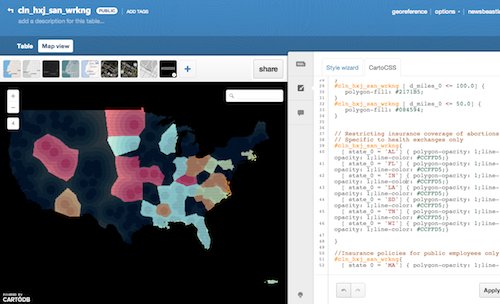
We tried outlining the different shapes and showing them in different colors:


We tried coloring the hexagon outline by the different laws that were in effect. Creating a sensical hierarchy proved difficult:

Highlighting Puerto Rico:

A value-by-alpha chart where census tracts are shaded by their percentage of women of reproductive age. Unfortunately it’s not that intelligible and the heat map overlay is a much cleaner way of showing this relationship:

Before we made the hexagon grid how the map looks if you use census tracts:


.png)