
Map of the Week: Trailing Fishers in the Suburbs


Guest post by Laura Allen
When I pitched my article Keeping up with the Carnivores for JSTOR Daily on the encroachment of predators into urban America I knew that one of my favorite carnivores fishers were perfect for the story. Fishers are slinky members of the weasel family that have bounced back in recent decades from historic hunting pressure.
In 2012 when I was writing new interpretive panels for the restored dioramas in the American Museum of Natural History’s Hall of North American Mammals (you know it—the one with the big brown bear) I learned from mammalogist Roland Kays that fishers were no longer confined to deep evergreen forests as in the White Mountains NH scene depicted in the 1950’s-era diorama below.

Kays’ GPS-tracking studies had turned up fishers in the populous suburbs of Albany NY and the species has been making its way into even more crowded areas along the East Coast such as Westchester and Boston. Last summer an intrepid fisher was even spotted skulking along a Bronx street at dawn.
These enigmatic animals are most active at night when we’re least likely to notice them. I wanted my readers to get a feel for how close fishers can come to our homes and the businesses that we frequent right under our noses. So I decided to make some of the tracking maps that I had seen in Kays’ scientific papers come alive with CartoDB. Here’s how I did it.
Getting the Data
Kays referred me to Scott LaPoint one of his former graduate students who had collected the fisher data. Here’s Scott and a fisher with a GPS collar. The animal is sedated otherwise she wouldn’t be so compliant.

Scott had mapped some of his data points on Google Earth but hadn’t done much with the data for a public audience. He sent me a screen shot of his maps of Phineas a fisher lingering in forest fragments near a major mall subdivisions and six lanes of the I-87 outside of Albany.
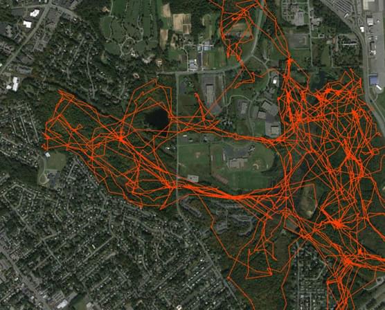
Without any design or interpretation Phineas’ dataset looked like a plate of spaghetti: it was comprised of 2 434 points collected over three weeks time during the winter of 2011. My goal was to tease apart that spaghetti.
I was inspired by CartoDB maps from a Belgian animal-tracking project called LifeWatch which visualized two months of movements of a lesser black-backed gull named Eric. Using LifeWatch’s pointers I asked Scott to format a CSV of Phineas’ movement data for me with three columns:
- latitude in decimal degrees
- longitude in decimal degrees
- timestamp
I also wanted to give viewers context for where fishers live beyond Albany and where they used to live in the past. So Scott also passed me shapefiles for the fishers current range and their “refugia” range - where the species was at its most contracted distribution during the 1800s.
Playing With the Data
I imported Phineas’ data to CartoDB then tried a simple occurrence map that showed where he was hanging out most often. This was easy to make with CartoDB’s intensity option in the visualization wizard. Phineas’ data points were anywhere from a minute to an hour apart. Since the intensity map shows each point as semitransparent the more closely spaced in time and space the points are the darker the resulting color.
The takeaways? The occurrence map shows two things best: Phineas’ territory and the places where he spent much of his time. The darkest spots are not dense in the strict sense which are only used by females to give birth and to raise young but rather trees or brush piles where this fisher loitered for sun and shelter on a cold day.
But the occurrence map didn’t explain timing: when he was resting moving or how he got from one place to another.
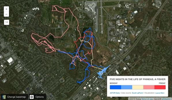
Making the Final Map
To show how Phineas changed his location over time I needed to draw lines between the points as Scott had done with Google Earth. I duplicated the data table then employed the same PostgreSQL queries used in LifeWatch’s Map of Trips Per Day to add a day_of_year column and lines between the days.
Next I simplified. I imagined this map could put Phineas’ “work week” into perspective—five nights of activity while we humans slept unaware. I selected the five most interesting consecutive nights where Phineas not only roamed a great distance but also ventured into backyards and across the highway and back. I filtered these days from my visualization using this SQL query.
##_INIT_REPLACE_ME_PRE_##
SELECT * FROM phineas_filtered_5day
WHERE
(day_of_year >= 38 AND day_of_year <= 42)
##_END_REPLACE_ME_PRE_##

The result was much simpler spaghetti but Phineas’ tracks needed even more granularity—how far did he go on Monday? Tuesday? I made a few more decisions:
- Applied a 5-bucket choropleth map using CartoDB’s Wizard.
- Chose a color ramp with an intuitive progression of shades.
- Tweaked the colors in CSS to make the nightly lines more easily distinguished.
The result:
Adding Interactivity
Now I wanted to make the map interactive by highlighting notable moments on Phineas’s journey.
First I made all the points slightly visible along his route—much like local stations on a train line—by adding a new layer. This layer imported the points from the original table the one without the lines.
Second I formatted the notable moments. To the “points” data table I added two new string columns one called "details" and the other called "level". To selected timestamps I entered a caption in "details" relating for example that Phineas boldly darted across a cul-de-sac on Monday at 8AM precisely when people would be departing for their own jobs.
For those timestamps with a caption I also added a unique identifier in "level" (the word “second”). This was my shorthand that only these selected timestamps would have a second "level" of point size—the express stops so to speak on that train line which obscured the little points underneath. I styled the CSS for a larger point width a black fill color and a colored outline. Here’s an example of my CSS for the “Friday” highlights:
##_INIT_REPLACE_ME_PRE_##
/* choropleth visualization */
phineas_data_filtered_points_only::points {
marker-fill-opacity: 1; marker-line-color: #fff; marker-line-opacity: 0; marker-fill: #fff; marker-allow-overlap: false; marker-placement: point; marker-type: ellipse;
[day_of_year=42] { marker-fill: #ff4d4d; }
[level='second'][day_of_year=42][zoom=13] { marker-fill: #000; marker-width: 7; marker-opacity: 1; marker-line-opacity: 1; marker-line-width: 2; marker-line-color: #ff4d4d; } } ##_END_REPLACE_ME_PRE_##
I also customized the size of all points dependent on the zoom level so they wouldn’t disappear when backed out nor overwhelm the view when close up.
Third I enabled infowindows for the points layer turning on the "timestamp" and "details" column. Now people could hover over any point to get a little or a lot of info.
I quickly realized however that the timestamps Scott had formatted were problematic for the popups. No one was going to read 2011-02-07T08:02:00Z and understand when Phineas was there. So to my “points only” table I added a new string column called "date" and used this PostgreSQL query to convert Scott’s timestamps into a string for example: Mon Feb 07 8:02 AM.
##_INIT_REPLACE_ME_PRE_##
UPDATE phineas_data_for_laura
SET date = to_char(esttimestamp  'Dy  Mon DD YYYY HH12:MI:PM')
##_END_REPLACE_ME_PRE_##
Here are other date/time formatting options that you can use.
Range Changes
Finally to visualize how fishers’ range has changed over time I imported the current and refugia range shapefiles into CartoDB added them as separate layers to the visualization and styled them using the Visualization Wizard’s “Simple” option. I added a hint in the title to zoom out and voilà: in one map we can see five nights in the life of Phineas and 100+ years for the species.
If you live outside of the fishers’ current range but think you’ve spotted one in your backyard take a picture and tweet me
